Hello again! Sorry for the long blog silence. I hope all is well with you. I’ve been busy offline, in part answering some interesting questions from CHH readers.
I’ve also been doing a lot of reading, as I try to get a clearer understanding of several ongoing Clark House Historian research topics. It’s going well, but I haven’t got much written up yet. More coming soon. Watch this space.
Under repair
By the way, if you’ve been to the official Jonathan Clark House website in the past few days, you may have seen this 404 error message, in place of our usual colorful and informative pages:

I contacted Clark House director Nina Look, and she assures me that they are aware of the problem, working on a solution, and expect the Jonathan Clark House museum website to be back up shortly. (It’s even possible that the problems may be fixed by the time this blog post goes live on Friday morning.)
Meanwhile…
Graphic Design for the JCH

In other news, I’ve signed on as the new part-time graphic designer for the Jonathan Clark House Museum newsletter, posters, and other visual products. I will continue my independent, volunteer, Clark House Historian research and blog posting, but I’ll also help prepare various JCH publications, using the design and layout skills that I’ve developed in over 400 illustrated blog posts here at CHH.
Although my new job is generously titled “graphic designer,” I think of myself as more of a 21st-century typesetter. And for what it’s worth, I actually have experience doing what the fellow in the above photo is doing, hand-setting type for printing on hand- and smaller electric-powered presses. It’s been a long while, but I still recognize a composing stick when I see one, and know to reach into the upper case for my capital letters.
Interestingly, this fellow’s upper case looks like it’s filled with lead slugs, thin strips of metal used to separate the lines of type in the composing stick. I wonder where he keeps his capital letters? We used a proper upper case for the capitals, like this typesetter in Minnesota:
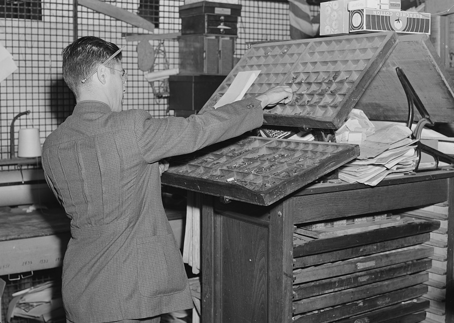
In addition to the upper- and lower-case trays of type that this compositor is currently using, the right side of his composing desk has slots for storing and easily accessing additional trays of different type fonts and sizes, a typical set up in many print shops.
Fun fact: Jonathan and Mary Clark’s daughters Theresa (born 1850) and Laura (born 1852) were still living with their widowed mother in Milwaukee in 1870 and, according to the 1870 Milwaukee City Directory, both girls were employed by the Milwaukee Sentinel, with the job title “printer.” It’s very likely that they were compositors at the Sentinel, hand-setting type much like the men in the photos above.
Anyway, I’m looking forward to helping put together the JCH newsletter and other visual items as we continue to spread the word about the Jonathan Clark House Museum and its programs and activities.
I’ll be back here soon, with more Clark House history. See you then.
__________________________
CREDITS:
• Lee, Russell, photographer. Mr. Ray Halstead, FSA Farm Security Administration rehabilitation borrower. Dead Ox Flat, Malheur County, Oregon, May, 1941. Library of Congress.
• Lee, Russell, photographer. Setting type by hand. Newspaper office. San Augustine, Texas, April, 1939. Library of Congress.
• Vachon, John, photographer. Setting type by hand. Litchfield Independent, Litchfield, Minnesota, September, 1939. Library of Congress.
And special tip of the hat to Mr. Johnson, genial educator and undisputed boss of my junior high school print shop. He ran a tight, safe, shop, and we had a great time learning the basics of the craft. Thanks, M.J.!

Pingback: Back on track… | Clark House Historian
Pingback: Clark House News – May, 2024 | Clark House Historian